RolePrincipal Product Designer
SummaryAt Attentive, I co-led stewardship of the internal design system, Picnic, in collaboration with cross-functional partners across Design, Engineering, Product, and Accessibility.
Our team maintained component libraries across 2 repositories, implemented scalable updates, and developed new components aligned with evolving product requirements.
OutcomesI drove adoption through internal documentation and presentations that reinforced the design system’s value and consistency with my cross-functional peers.
I leveraged my lessons learned from this design system into my governance of the platform-wide reporting design guidance.
This invaluable experience strengthened my skills in design system management, governance, accessibility compliance, and cross-functional collaboration.
Tools & PlatformsFigma
Storybook (React)
Chromatic
Github
TeamsProduct Design, UI Platform, FE teams
Meet Picnic
OverviewPicnic is Attentive’s internal design system and the shared language between designers and engineers building products across the platform.
It provides a robust set of UI components, reusable patterns, and documentation that keep experiences consistent, scalable, and accessible across channels. Picnic balances brand expression, product needs, and accessibility at its core.
We need Picnic to be a stable, trusted source for design excellence; one that teams could confidently build on, contribute to, and evolve together, without any blockers.

My tenets for a good design system
Consistency & Efficiency
Streamline workflow, save time, and ensure a consistent user experience.
Design systems show what already exists and how to use it now.
Scalability & Flexibility
Scale designs effortlessly, accommodate evolving needs, and maintain brand integrity.
Design systems support creativity and experimentation without loss of control.
Collaboration & Communication
Promote cross-functional collaboration and create a shared vocabulary.
Design systems are owned by everyone who touches it- it is a shared responsibility.
Maintaining Picnic
There are two important parts of this design system: the component repositories, and the people who manage it all.
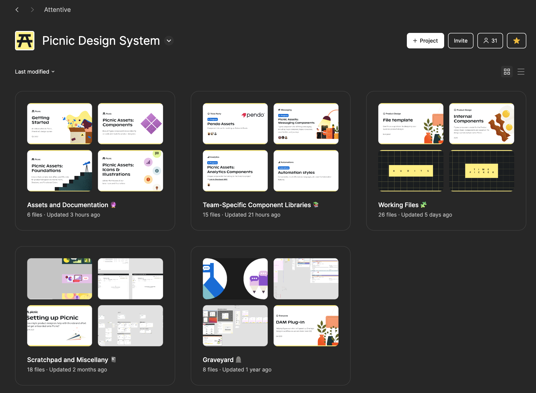
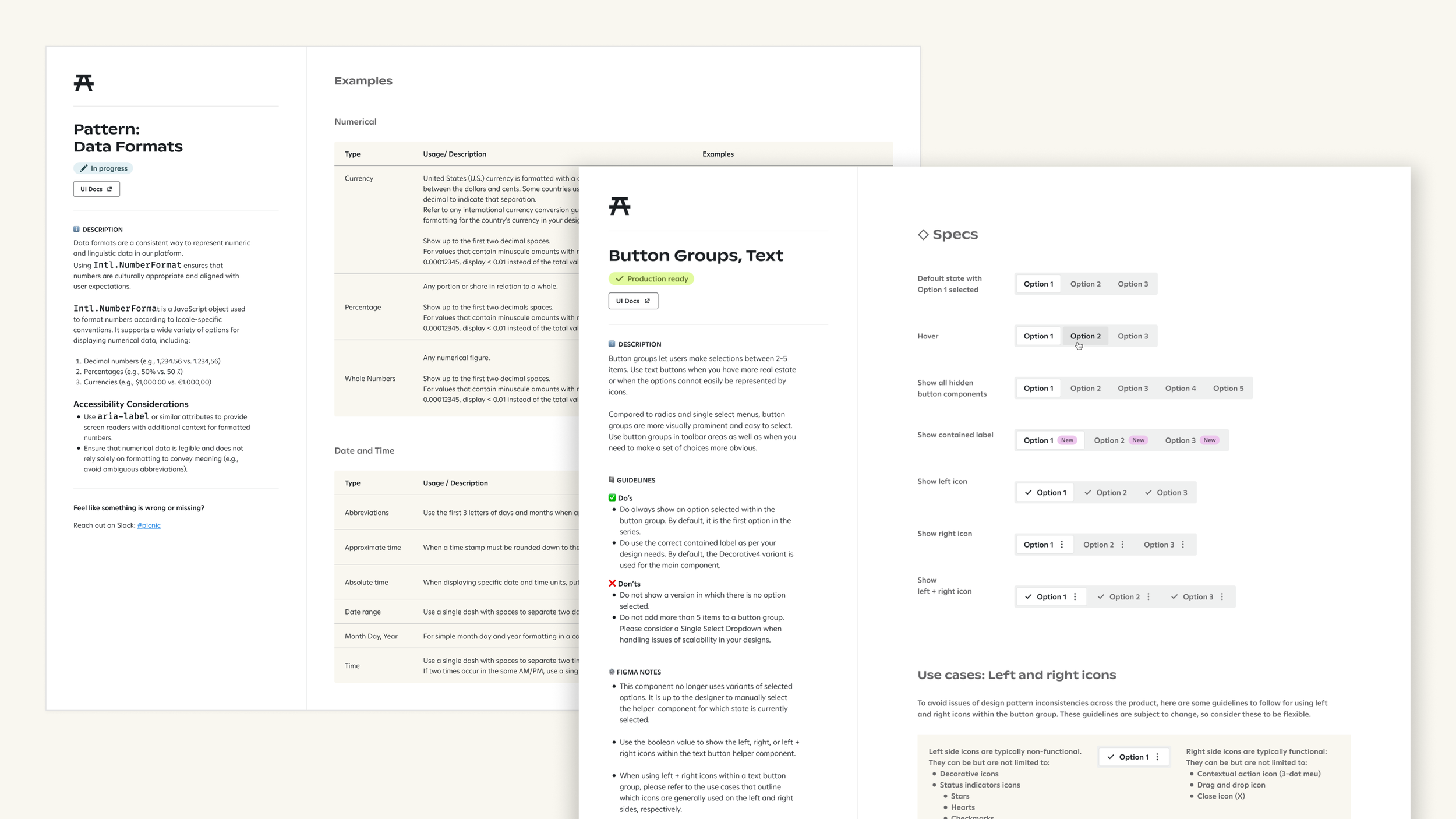
Picnic spans two primary libraries:
A Figma component library for product designers
A React component library, documented in Storybook, for engineers
Both libraries mirror each other as closely as possible in naming and intent so teams can move seamlessly from design to implementation.

In Figma
~for designers~
I established a clear split between “Assets & Documentation” (foundations and global components) and “Team Component Libraries” (patterns tailored to product areas like Reporting & Analytics, Campaigns, and AI).
I encouraged designers’ autonomy to regularly maintain their specific team component libraries.
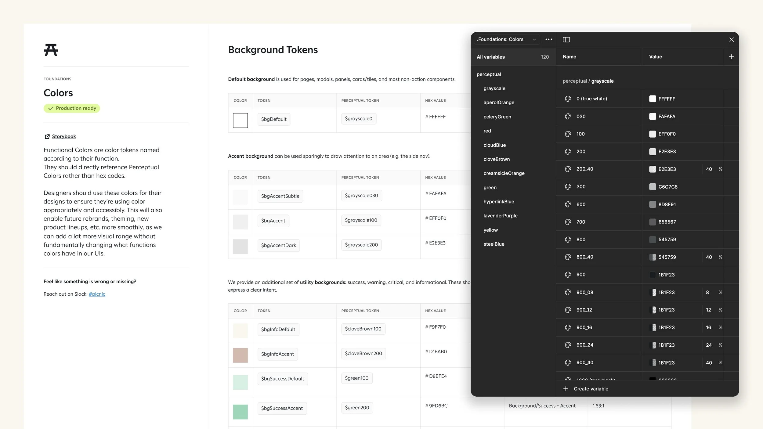
I used shared tokens for typography, color, spacing, elevation, and motion so updates could propagate reliably across components.
I adopted consistent naming and configuration for components to make Dev Mode handoff more predictable for engineering.
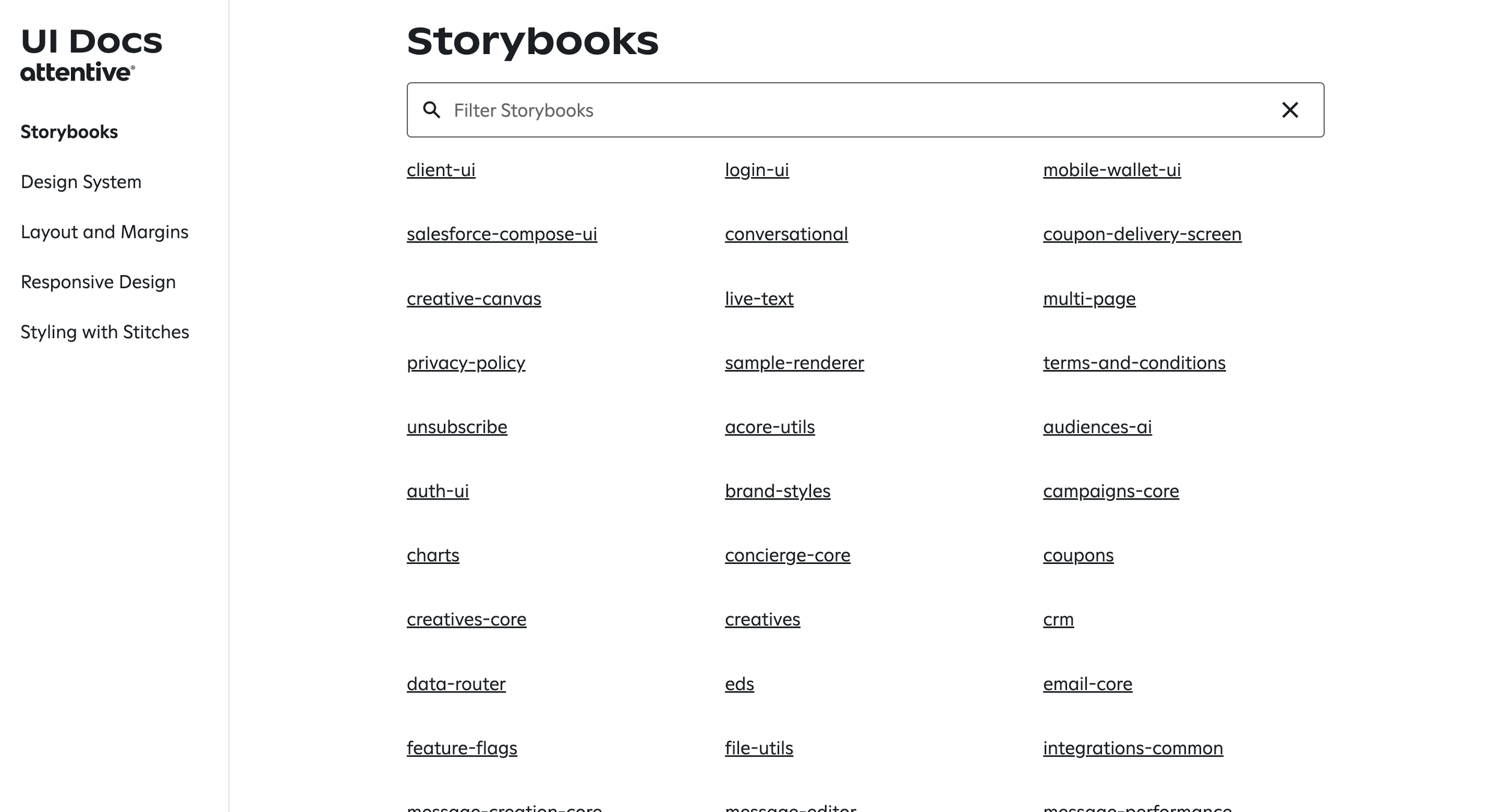
In Storybook
~for developers~
I partnered with UI Platform Engineers to keep the React component library in Storybook aligned with the Figma library, including names, props, and usage guidelines.
We used Storybook and our UI docs site as the source of truth for implementation details, edge states, and accessibility behavior.
The People of Picnic
I helped shape and participate in recurring practices with my colleagues that keep the system alive.
Like any real picnic, it’s better with friends.
RitualsPicnic Steering (bi-weekly):
A formal meeting with 3 UI Platform Engineering and 3 Product Design stakeholders to review proposed changes, discuss roadmap, and make decisions on component additions, deprecations, and breaking changes.
Picnic Party (weekly):
An informal open session for designers and engineers to bring questions, in-progress work, and component proposals for critique and feedback.
Within these spaces, my role allowed me to:
Advocate for user-centric and accessibility-first solutions when evaluating component changes.
Help teams refactor one-off patterns into reusable components where appropriate.
Facilitate decision-making and documented outcomes to keep the broader org aligned on what Picnic does (and doesn’t) own.
GovernanceTo avoid turning Picnic into a dumping ground of disconnected parts, we followed a few principles:
Rule of Three:
A new component or variant should have at least three clear use cases across the product before graduating into Picnic. Otherwise, it lives in a team-specific library until its value is proven.
Involve your Picnic peers:
Encourage collaboration early between designers and engineers when proposing changes, ensuring the system serves multiple perspectives and not just one product team.Iterate & improve continuously:
Use feedback from product surfaces, QA, and accessibility reviews to refine components and documentation over time.
I applied these rules consistently when reviewing proposals from feature teams, helping them decide whether to:
Extend an existing Picnic component
Create a local pattern in a team library
Or graduate a mature pattern into Picnic for broader reuse
Mini-case study: Timepicker component
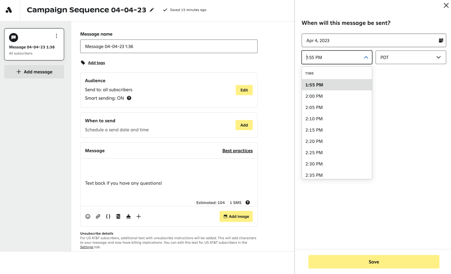
April 2023 – A problem is identified!
The Magic Composer team identified a need for a better UX & UI for picking a specific time to send a Message. They were using a Single Select to get the job done for the time being.
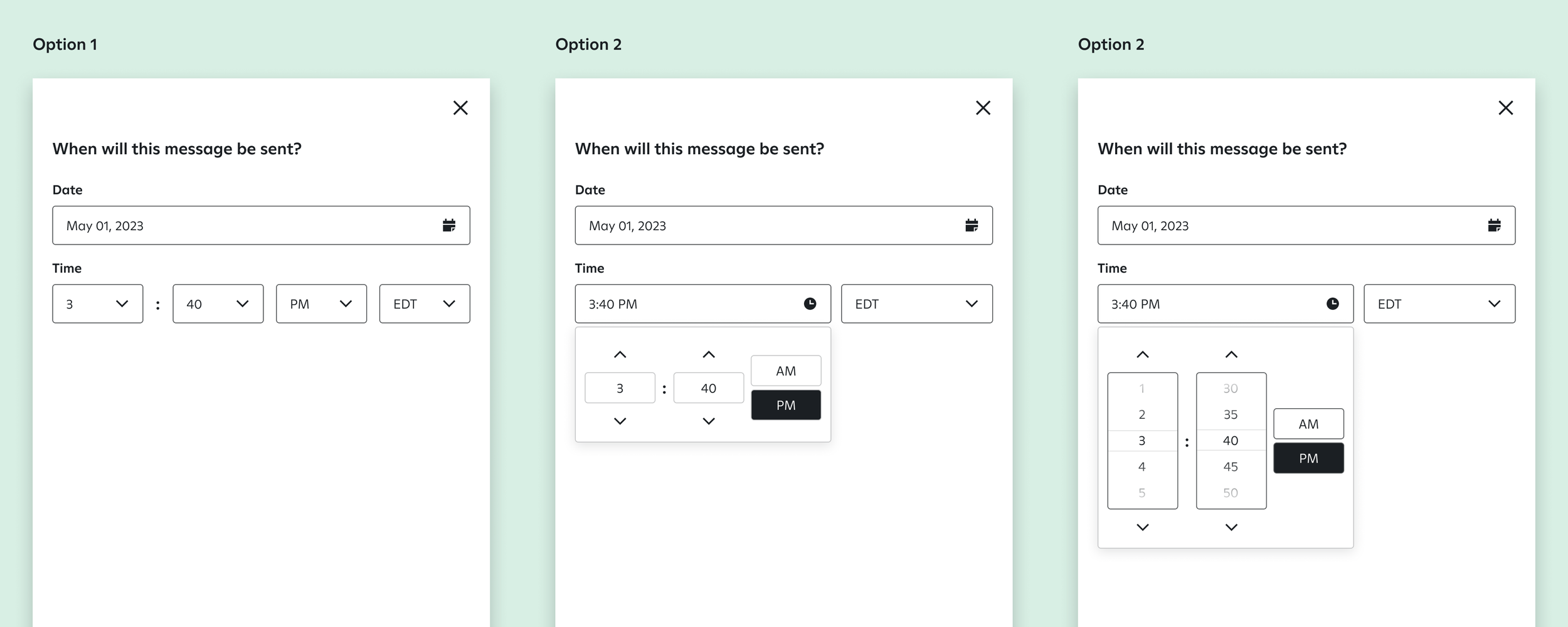
April 2023 – Design explorations begin!
Product Designers begin to explore UX & UI iterations on how a Timepicker will operate in our UI, abiding by the tenets of accessibility, brand expression, and product needs. Progress is shared in the weekly Picnic Party.
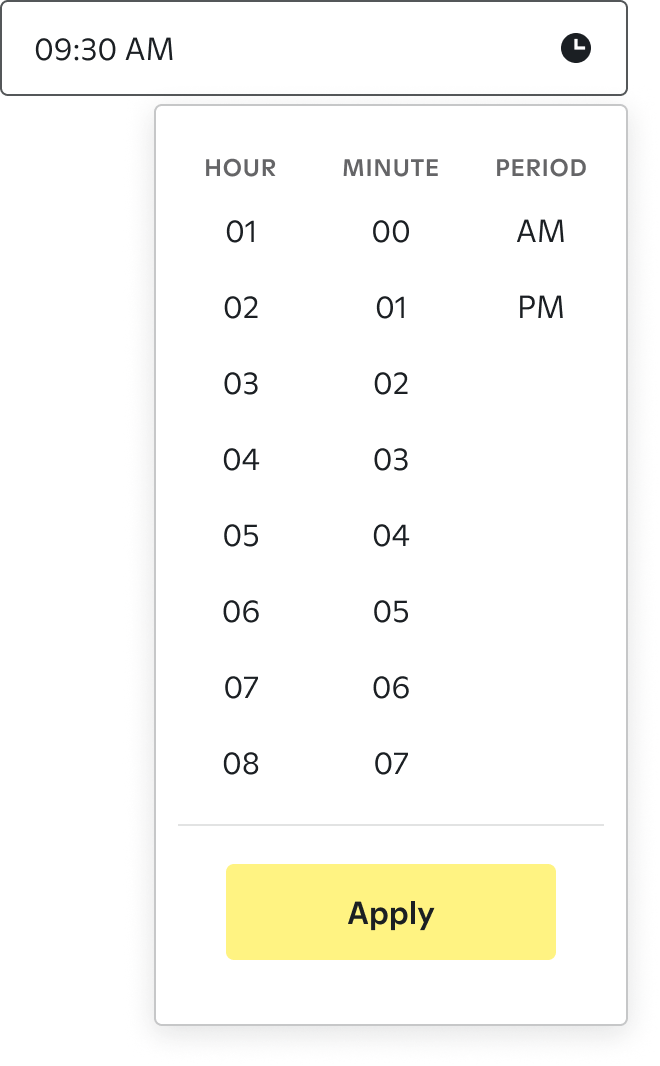
Jun-Aug 2023 – A new component is born!
Design proposals were brought to the cross-functional Picnic Steering meeting. After evaluating them with expert criticisms and considering the Rule of Three, a winning design solution was agreed upon.
Product Design includes the Timepicker component in Figma's Picnic Design System.
My reflections on design systems
Design systems aren’t stagnant component libraries that are solely used by a few teams in their product design workflows. They live, change, and adapt over time.
When thoughtfully implemented across teams and departments, they contribute to a culture where innovation and excellence in design, engineering, and product thrive.
The people participating in this design system’s success are just as important as the clever naming and organized components we establish.

True things spoken by my Attentive comrades about me.
"Dom leads our Picnic design meetings and manages to pull a ragtag crew of individuals into meaningful conversations every week that result in a better product than we had 30 minutes before we started."
— Tony Molinero, Principal Product Designer
“Who's always on the lookout, making sure there are no barriers to accessibility in our design system and data visualizations? Dom is! In the past couple of weeks, Dom has coordinated efforts to help make our reporting tools even more accessible by researching colors and interaction patterns that can help everyone get the most out of our data visualizations. Happy Global Accessibility Awareness Day 2025, Dom! Thank you for always being an advocate for accessibility at Attentive!”
— Kevin Kalahiki, Design Accessibility Program Manager (a11y)
“Dom is a strong leader for our Picnic design system. She runs two meetings, including our design-focused "Picnic Party" on Fridays and our "Picnic Steering" meeting where design collaborates with engineering. Dom has continued to guide our design system, adding new components, icons and documentation that help design and engineering work more seamlessly together.”
— Alex Statom, Manager & Design Director